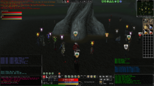
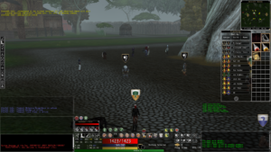
The Minimal Skin is a Shadowbane interface skin that was designed by me as a replacement for the original Shadowbane interface. Much like the name suggests, it is created more around minimalizing the interface to be more around form and function than looking good (I am no Ashton Kai who created most of the original Default skin).
I highly recommend checking out Meek’s original Meekskin and his new Meekskin 4K, especially the latter if you’re using a higher than 1920 resolution. Default and Minimal Skin are a bit too small when you’re running something 2K and higher.
Last Updated on March 21, 2021 @ 9:25 PM CT
If you downloaded a version before the above date, I’d recommend getting the latest version. Look for the “!MinimalSkinNotes.rtf” file in the zip to see all the patch notes but here is the latest items changed.
- March 21, 2021
- Fixed an issue where Load Layout was not showing a list of existing layouts that can be imported. Special thanks to Keraehl on Steam for catching this!
- March 19, 2021
- First MVP (minimal viable product) of the tabbed versions of the QuickBars; not as happy with the vertical version but it works
- March 18, 2021
- Just general cleanup and alignment of icons on the TemperUI
- Trying out a tabbed version of the Horizontal QuickBar but it is VERY rough and not ready for use
- March 13, 2021
- Swapped the images for following in the Group HUD (had them backwards originally)
- March 12, 2021
- Replaced the “Ready” overlay for powers with a new image to make it easier to see what is in cooldown (note, this does not update those dragged off the HUDs. You have to update the Default skin to adjust that)
- March 11, 2021
- Added some tabs to the Group HUD for normal actions, Leader actions, and formations
- Just minor cleanup of some of the menu files that were missing a few elements
- March 10, 2021
- Fixed the issue with timestamps on the Text HUD causing a client crash
- March 9, 2021
- Added the group arrows to the (mini) map
- March 7, 2021
- Replacing some of the icons so that they can be used for a higher resolution skin version
How do I use it?
Before doing the below, make sure you’re fully logged out of Shadowbane and the (Shadowbane) client is not running.
- Download the latest version of the Minimal Skin.
- I have it here on Dropbox: https://www.dropbox.com/s/ls1e84o0bsd66cc/Minimal.zip?dl=0 (Last updated, March 21, 2021)
- You can also get it from MyDrive in case you’re having issues with Dropbox: https://drive.google.com/file/d/1l9PsmrlK4qSJoN-7qHPtG2TCCx83xCZU/view?usp=sharing
- The client uses the zip file so you do not need to unzip it. Only do so if you want to poke around in it (outside of the game).
- Once downloaded, you will want to copy Minimal.zip to your skins directory.
- If you’re using the Steam version of Shadowbane, you will want to locate where your version of Shadowbane is installed. The easiest way to do that is to go to your Steam library, right-click on Shadowbane, select Properties, go to the Local Files tab, and then click the Browse button. Viola!
- Go into the Skins directory and copy Minimal.zip into it.
- Log into Shadowbane
- Go to the Main Menu (hit the ESCape key) and then go to Settings, Interface Skins, and click on Minimal
- Your interface should now refresh and you should see the Minimal Skin.
What’s different about it?
The art style (if you could call it that) is the first noticeable thing. I originally created this early on when I worked at Wolfpack Studios before we were acquired by Ubisoft. While I love the art direction of the Default skin, I wanted something that gave a bit more visual information but didn’t feel like it used too much of my screen’s real estate. That and I’m not an artist so simple lines are easier for me 🙂
Here are the overall elements you’ll see in it.
TemperUI
I didn’t know what to call this so I went with the naming convention from when I worked on WoW skins. This is a basic interface with a variety of data you generally want at your fingertips such as Attributes, Defense and Attack ratings, Weapon Damage, targeting, the hotbar, and more. It’s under Minimal Windows main menu option as TemperUI.
The Weapon Swap Window
This is actually a combination of two Windows, the RHeld and LHeld slots from the Equipment Window and the Inventory Window (don’t worry, there is also a normal Inventory Window, too). You can use this Window to quickly swap weapons from your Held Slots to something in your Inventory. The downside to this is you can’t have your Inventory too full or the weapons you may want may be further down than your Window is displaying.
The Quick Bar
There are two versions of the “Quick Bar”, horizontal and vertical. On this you have a variety of buttons, from Combat Mode, Running, Sitting, and Flying to Quick Buttons for Stats, Skills, Runestones, Powers, Equipment, Resistances, and Inventory. Recently I’ve added the Heraldry and Death lists to this since I find myself needing to reference those often.
Group UI (small)
Ironically, unlike the Default skin, this one isn’t really small. It has larger bars and is easier to see if someone in your group is in trouble at a glance. If you transparent the rest of the interface, you mainly just see the name, attribute bars, and following toggle. I’m tempted to make a version of this for Healers that runs horizontal and only shows health.
Social Dashboard
A dashboard that shows all the socials your character can perform. This is something I saw in Meekskin (I think the 4K version) and you can quickly get to it from the TemperUI. It’s the last button on the left, just above your CONstitution attribute.
Resistances
I have greatly reduced the size of the Resistance Window and removed the Icons in it. This way you can keep the Resistance Window up while playing and see if you have had a Resistance Buff or Debuff. There is a known Bug with this window (in any skin); if you leave the Window open and log out then back in, it will show a blank window. To update this, just open and close the Resistance Window.
Powers with Text
As a nod to MadSage (and because it was a great idea) and then Meek who took it a step further, I’ve included a Powers Menu with Text. If you drag the Power Name off by its NAME, it will retain the name when you pull it onto the main screen (very helpful if you have icons that look the same).
Chat Windows
They look the same (with the exception of the art) but do not work the same. I have modified the Chat Windows so you can click through them. The downside is that you can only manage and move them by clicking in the section where you type in (the bottom portion).
Status Window
The only difference to this one is that I removed the Combat, Run, Sit, and Minimize Windows Buttons. All are placed in the Quick Bar with the exception of the Minimize/Maximize button.
Pet UI
Mainly just updated to look like the rest of the Minimal Skin
Tracking
Just skinned to look more like the rest of the Minimal Skin
What’s Next?
Good question. There is just some general clean-up that I need to do. I would also like to find a way to see if I can make a tabbed chat but I have a feeling that is something that would take code support and not something that can be done just via the Skin. I’d also love to have a countdown timer on the buttons for cooldowns but, again, fairly sure that would take some actual code support.
If you have any thoughts or ideas, let me know.

